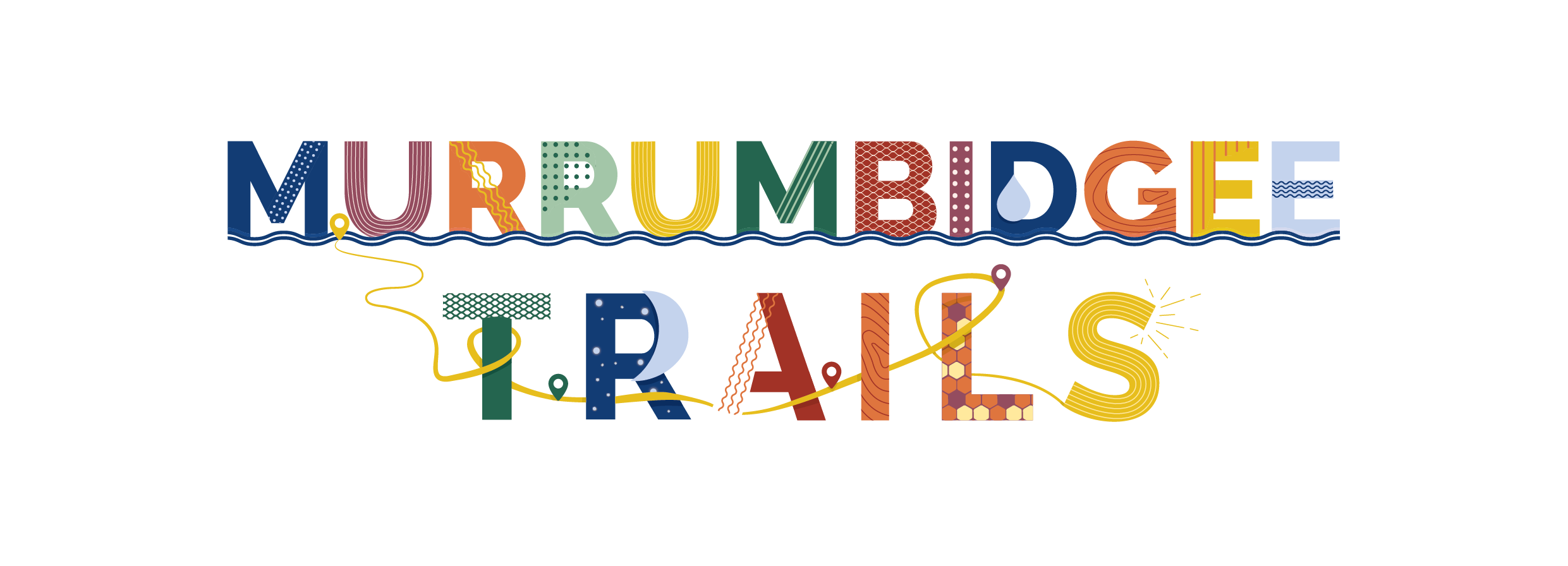
Murrumbidgee Trails Regional Identity
A brand built from the ground up, unifying four Local Government Areas through a bespoke visual identity, custom illustration suite, and 116-page publication that has since reached visitors right across New South Wales
-
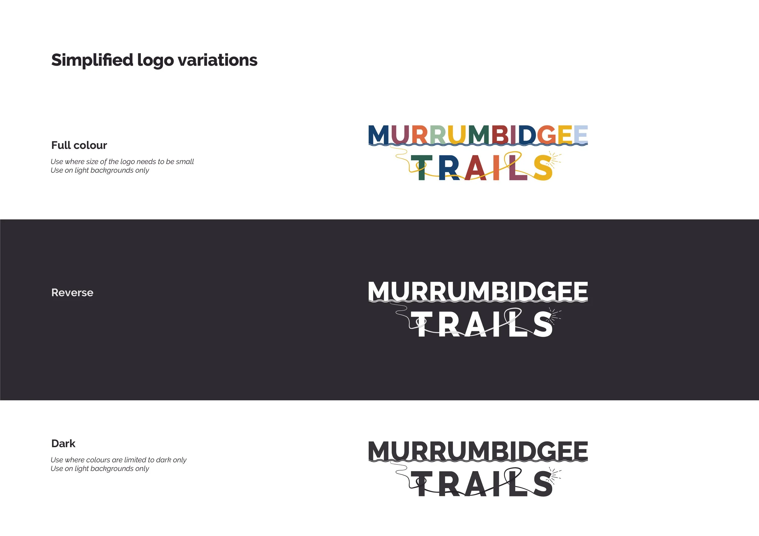
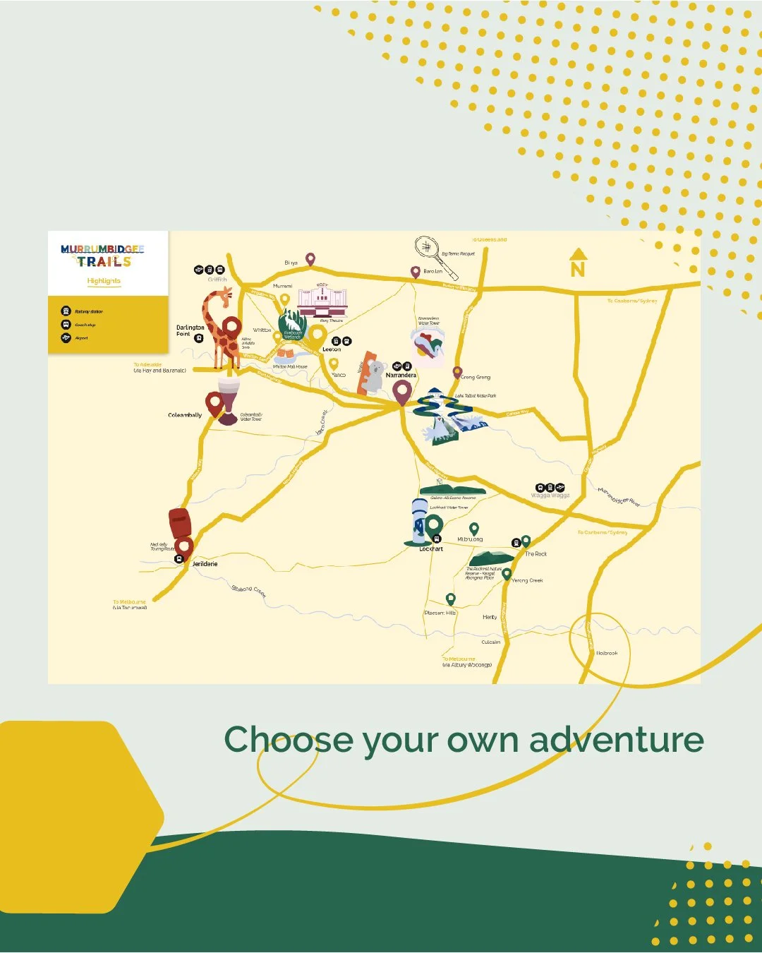
Branding identity built from scratch, no prior brand to work from, created to unify four Local Government Areas (Leeton, Lockhart, Murrumbidgee, Narrandera)
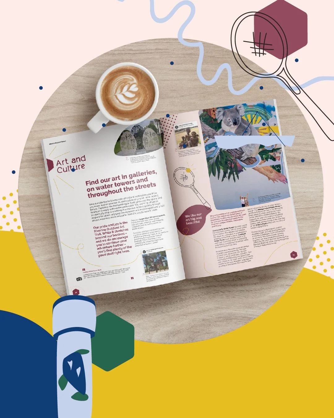
Illustrations - all custom, bespoke artwork created to reflect the character of the trails and complement the brand palette and textures
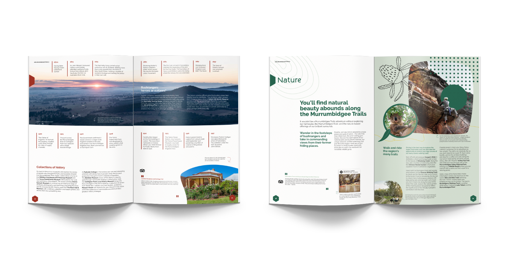
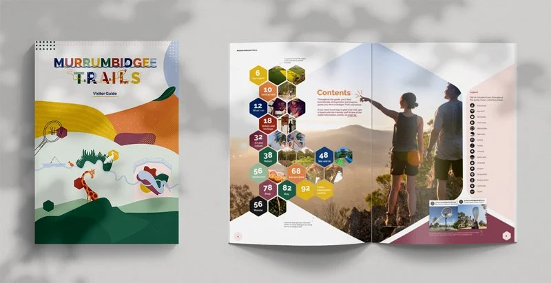
Publication design - typesetting and layout of the 116-page visitor guide, redesigned from A4 to A5 format for the second edition
-
March 2020 - December 2020
-
Brand - Minta Viski
Publication Strategy - Assembld
Copy - Assembld
Printing - Chambers Whyte
-
20,000-copy print run, reprinted to meet demand across NSW
UV spot coat finish highlighting LGA shapes throughout
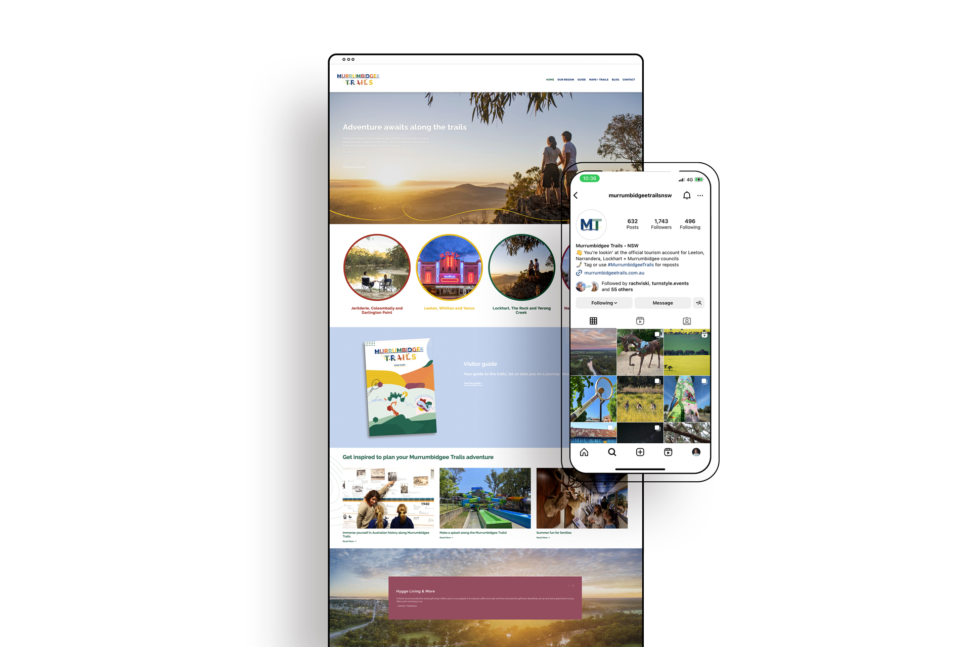
Distributed through visitor centres across NSW
Reinvested in 2024. Read the case study here.
How do you build a brand from the ground up, across four shires, four communities, and four sets of opinions?
There was no existing brand to work from when Murrumbidgee Trails landed on our desk. No colour palette, no visual language, no shorthand. Just a region of extraordinary depth and character, and the challenge of distilling it into something that could speak for four distinct Local Government Areas: Leeton, Lockhart, Murrumbidgee, and Narrandera, without flattening any of them into the other.
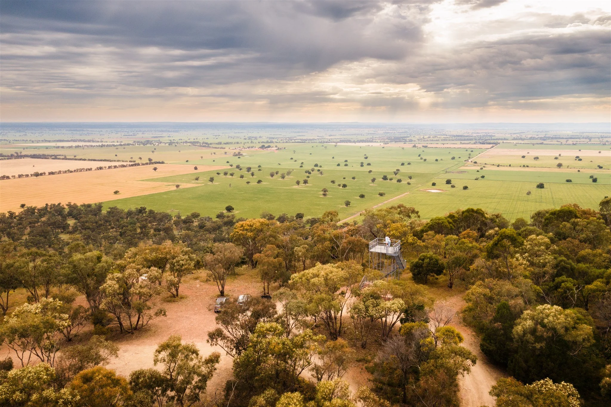
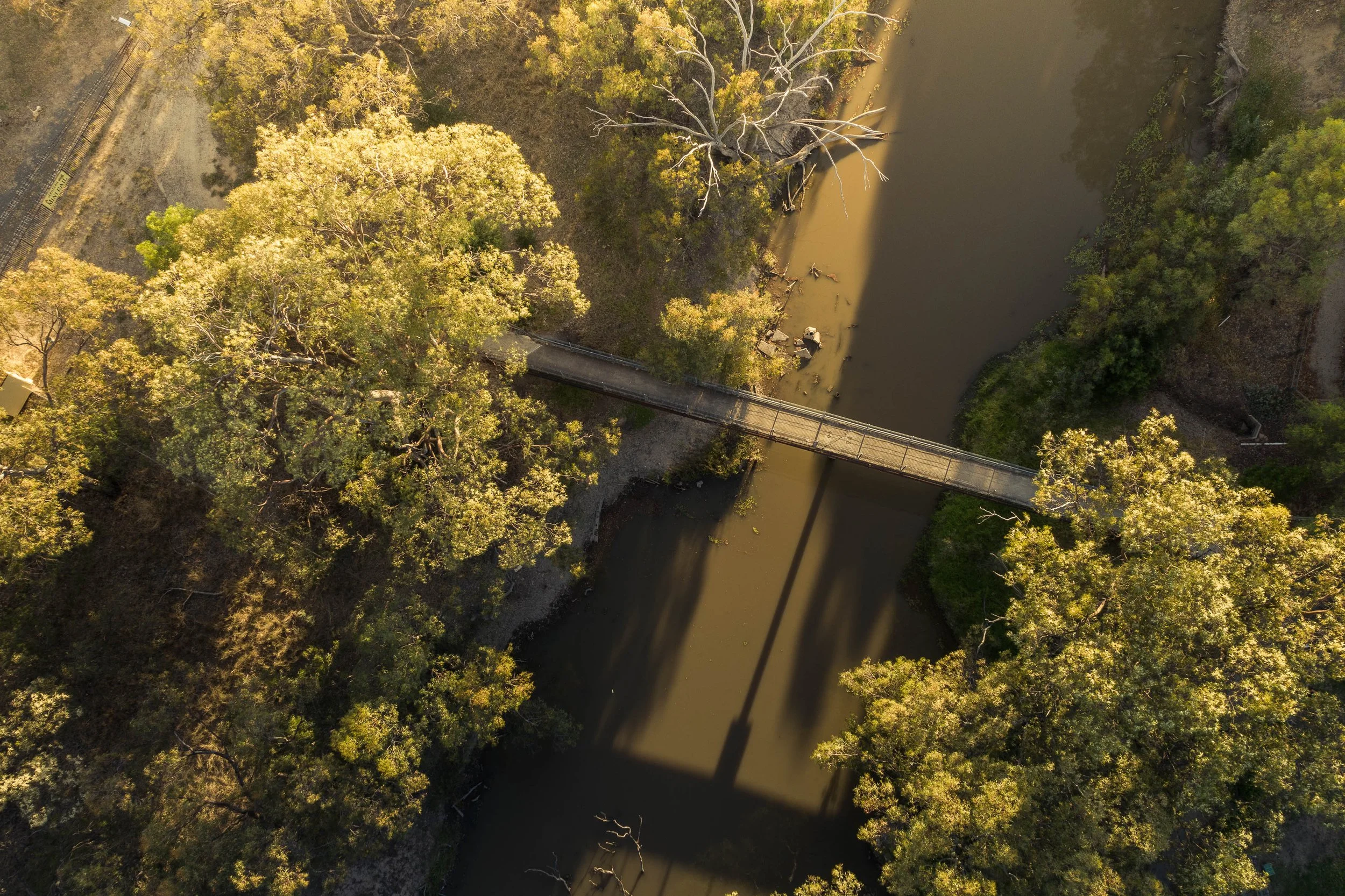
Each shire has its own landscape, its own history, its own sense of what makes it worth visiting. The brand needed to hold all of that together without resorting to a lowest-common-denominator aesthetic, the kind of safe, generic regional tourism identity that could belong anywhere and therefore belongs nowhere. That’s where research and stakeholder engagement came in.
Our starting point was always the communities themselves. We work from the inside out, rooting every creative decision in an understanding of place, talking to the people who actually live and work there, and treating local knowledge as a design resource.
For Murrumbidgee Trails, that meant four distinct conversations about four distinct places, and then the careful, considered work of finding what they shared: a pride in the region, a generosity toward visitors, and a landscape that rewards the people willing to slow down and look properly.
The solution was to build unity through a shared visual system rather than a single dominant look.
A consistent colour palette, illustration style, and typographic voice create the through-line — but the brand is designed to flex. The distinct shape of each Local Government Area became a recurring motif throughout the identity, a way of saying: we are one trails network, and we are four different places, and both things are true at once. In a state where regional tourism brands often blur into one another, that specificity is the point of difference, an identity that is unmistakably, unapologetically this place.
Getting four councils across the line on a brand built entirely from scratch could have been its own project. Instead, it became one of the most collaborative processes we've worked through.
As one of the project leads reflected afterward: "the tricky bit was working with four councils — four clients under the one banner — and you did very well."
Communities who cared deeply about how their home was represented brought that care into the room constructively, and the result is an identity that doesn't just have our name on it. It has theirs.
The second edition of the Murrumbidgee Trails Visitor Guide, the first major expression of the identity, went to a 20,000-copy print run and was reprinted to meet demand right across NSW.
One regional visitor information centre had copies walking off the shelves so quickly they had to keep stock behind the counter and put a placeholder out front. The client's verdict was simple: "the end result is amazing."
For us, success was about whether the brand actually worked in the world, whether it moved people to explore a part of the area they hadn’t considered before, or stayed an extra night (or two).
As a result, Murrumbidgee Trail was re-invested into another edition in 2024.