Founder and principal designer, Rach Viski is a research-led designer creating immersive healthcare environments and visual identities.
Her creative practice sits at the intersection of art, health and place, where public, healthcare and research settings are seen as living spaces where hope, belonging and care coexist.
Her role is to listen carefully, notice what is often overlooked, and synthesise insights into visual languages with a narrative focus.
Each project begins with building relationships, paying close attention to the evidence, and the finer details of how people use a space.
Video courtesy of The Sydney Children’s Hospital Network.
See the work:

Insights and Perspectives
Thoughtful explorations from our creative practice.
Discover how our connection to the natural world bridges environmental understanding with business outcomes to create lasting impact.
How do you create artwork for healthcare settings that connects with an entire community, is healing and hopeful and remains timeless?
How does one go from painting dunny walls as a kid of the 90's, to creating art for hospital wards?
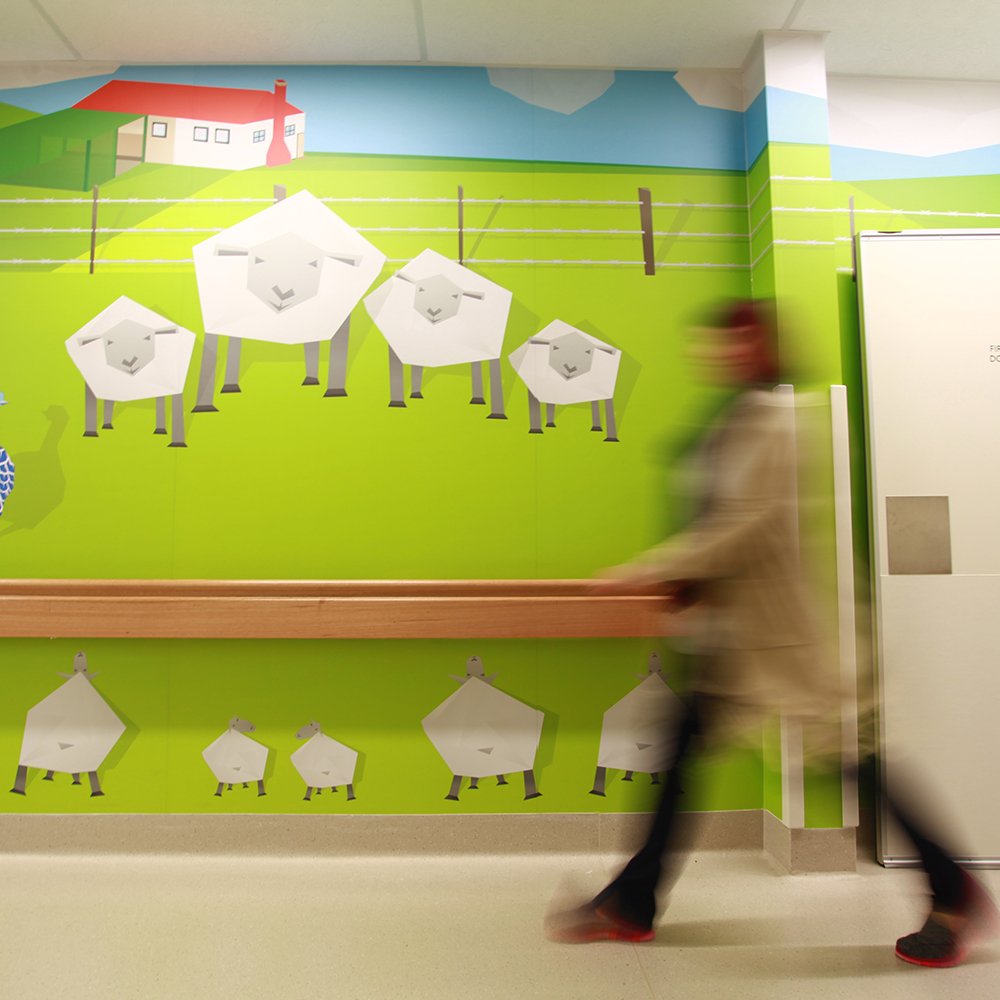
Every person who encounters this 22 metre-long corridor artwork in Griffith Base Hospital brings their own lens, their own story, their own way of interpreting the world around them. That's the beauty of co-creating art for healthcare settings where so many different lives intersect.
The impact of art extends far beyond aesthetics — it serves as a channel for human connection and healing. In a clinical healthcare setting, art becomes more than merely a backdrop; it transforms into a silent communicator, speaking directly to the human experience of vulnerability, resilience, and hope.
When you picture a digital artist, you might envision someone alone in their studio, Apple Pencil in hand, lost in creative solitude. I want to challenge that perception.
Like all skills, design thinking comes with the nuance of our narratives, the texture of regular practice, the reality of success and failure, and the curious conversations that happen along the way.
Human Centred Design (HCD) is designing with intent. It takes the guesswork out of designing for business. It turns the subjective (“I love the rain!”) into the objective (“It's raining”).
I started out the year like I do most others, devouring a tray of mangoes while promising myself I’ll be nicer to myself and loved ones, overthink less, be more… uh, I can’t remember now.
What I can recall is that I promised myself I’d make an effort to share my graphic design knowledge.









How does local recognition lead to impact beyond the wide horizons of home?