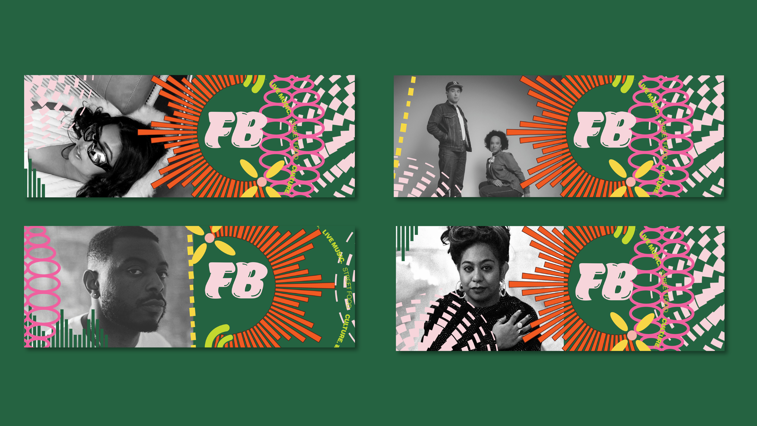
FUSION BOTANICAL Multicultural Festival
The visual identity for the city's premier multicultural festival, FUSION BOTANICAL needed to resonate across diverse communities while celebrating the unique setting of the Wagga Wagga Botanic Gardens.
-
Visual identity refresh (3x years)
Print collateral and signage
Physical brand touchpoints
Experiential print materials
-
March 2025 - October 2025
-
Huge thanks to the Multicultural Council of Wagga Wagga, the City of Wagga Wagga, and NSW Government’s Stronger Together Local Council Major Festival Grants for making this vision a reality.
Client - Wagga Wagga City Council
Visual identity and implementation - Minta Viski
Motion design - Alice Peacock
Printing - Chambers Whyte Design & Print
Fabricator - Littlewood Sign Solutions
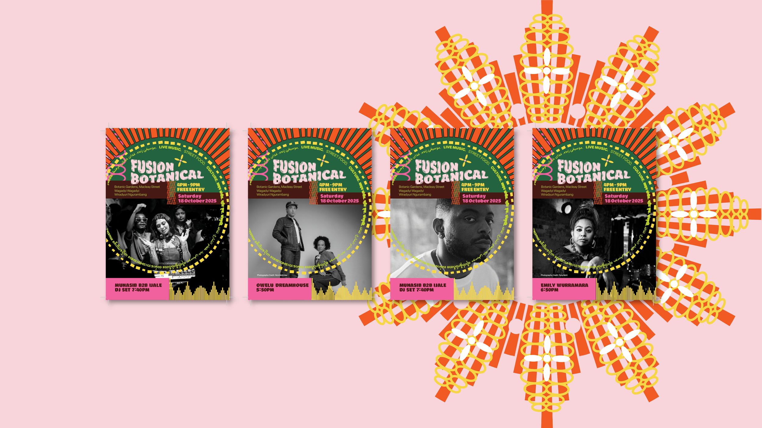
Graphic: This poster suite of headline acts was distributed across the city, making for easily recognisable and consistent touch points.
“FUSION BOTANICAL has grown to be one of the city’s biggest outdoor events, with thousands of residents and visitors from across the Riverina region and beyond soaking up sights, scents and sounds from around the world.”
Video: A look at the experiential wayfinding tower implemented at multiple sites throughout the festival venue.
FUSION BOTANICAL required a visual identity refresh that could represent its multicultural essence while honouring the Wiradyuri people as traditional custodians of the land. It also needed to be a modular system that the team could implement in-house in subsequent years, but still remain fresh.
The real challenge lay in creating a system that would work seamlessly across large-scale installations across the city’s existing infrastructure (bus shelters served as a subtle cue for using public transport - finding a car park at the festival is a challenge it gets that busy), and translate effectively to intimate print materials for community distribution.
Video: Motion design by Alice Peacock built excitement and shared key details while sparking curiosity. The perfect way to bring the refreshed brand to life and set the vibe for the event.
The visual identity needed to speak multiple languages, not just linguistically, but visually.
Every design decision was made with careful consideration of cultural nuances, ensuring the artwork welcomed all communities while respectfully acknowledging the traditional owners of the land.
The language hierarchy prioritised accessibility, with messaging crafted to be immediately understood by Wagga Wagga's diverse population.
Graphic: TV screens in across the Council building displayed messaging in the lead-up, inviting local food vendors, community acts and artists to apply to get involved. The community services team knew this was the most effective way to foster a sense of pride.
To capture attention across the expansive Botanic Gardens precinct and ensure visibility for all audience members, a bold, high-contrast colour palette was developed. These striking combinations were specifically chosen to:
Cut through the natural garden environment
Remain legible from a distance across the city and to cut through social media merkerint in the lead-up to the event
Create ease of wayfinding that embedded workshops, installations, performers and food vendors
Work effectively across varying lighting conditions throughout the 4pm-9pm event window
Appeal to diverse aesthetic and cultural preferences across cultural backgrounds
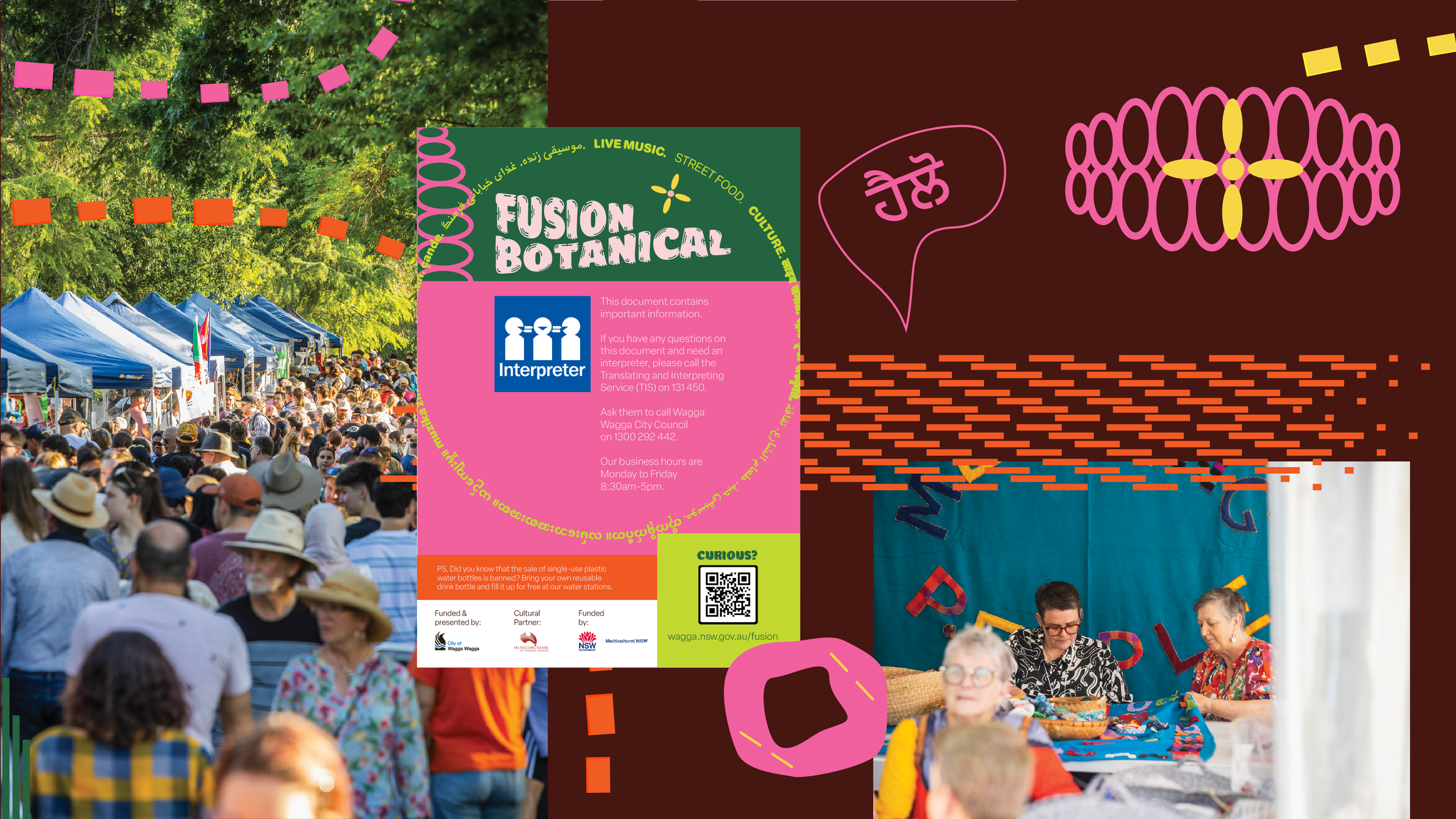
Graphic: Accessibility was front of mind, with interpreter services communicated through there Multicultural Council network and ambassadors.
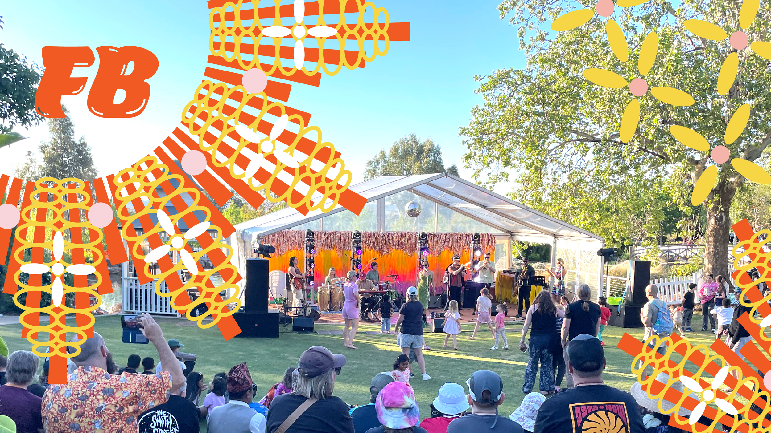
The design system drew inspiration directly from the diverse cultures that use the venue regularly, incorporating organic forms and botanical elements that transformed the gardens into an extension of the festival branding.
This approach allowed the event to feel naturally integrated into its environment rather than imposed upon it.
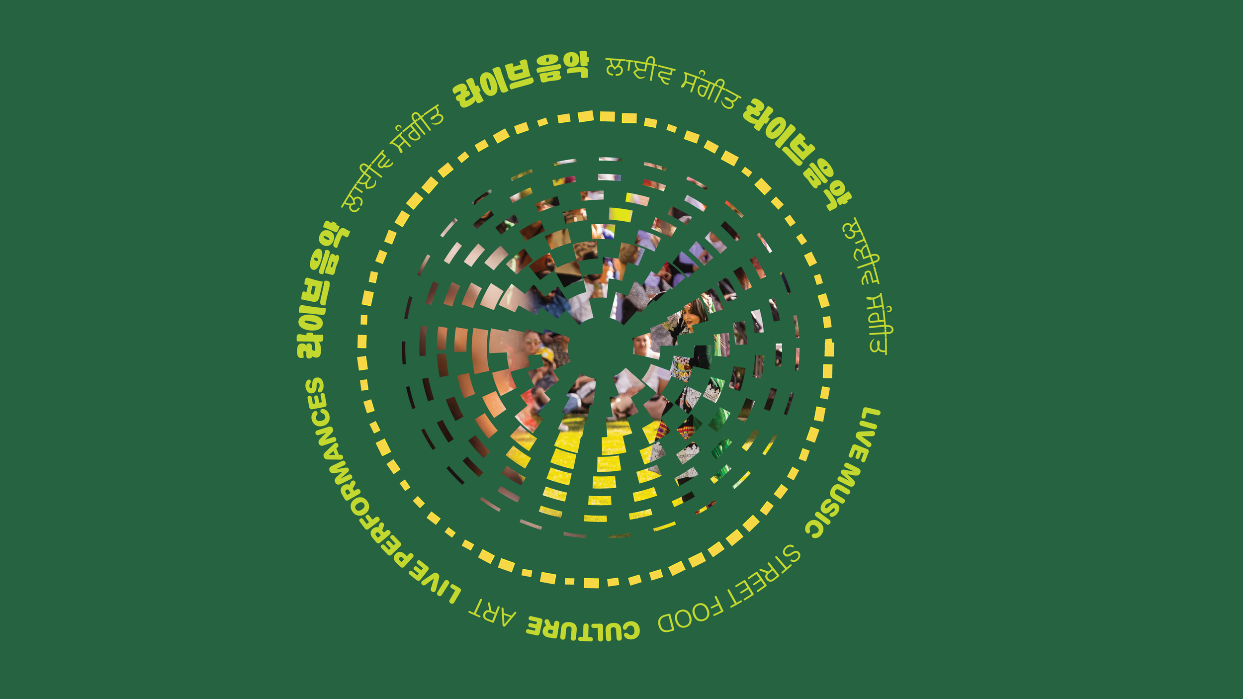
Graphic: The circular graphic device was a nod to the festival’s inclusivity for all people that make up the diverse community in Wagga Wagga.
The refreshed visual identity successfully supported FUSION BOTANICAL's growth into one of Wagga Wagga's biggest outdoor events, attracting over 8,000 attendees annually. The cohesive branding system enabled the festival to:
Create a memorable experience that celebrates both cultural diversity and local heritage
Establish a recognisable visual presence that honors the natural beauty of the Botanic Gardens setting
The success of the visual identity demonstrates how thoughtful design can amplify community celebration while respecting cultural heritage and natural environments.
The project stands as a testament to the power of inclusive design thinking in creating experiences that truly bring a city to life.
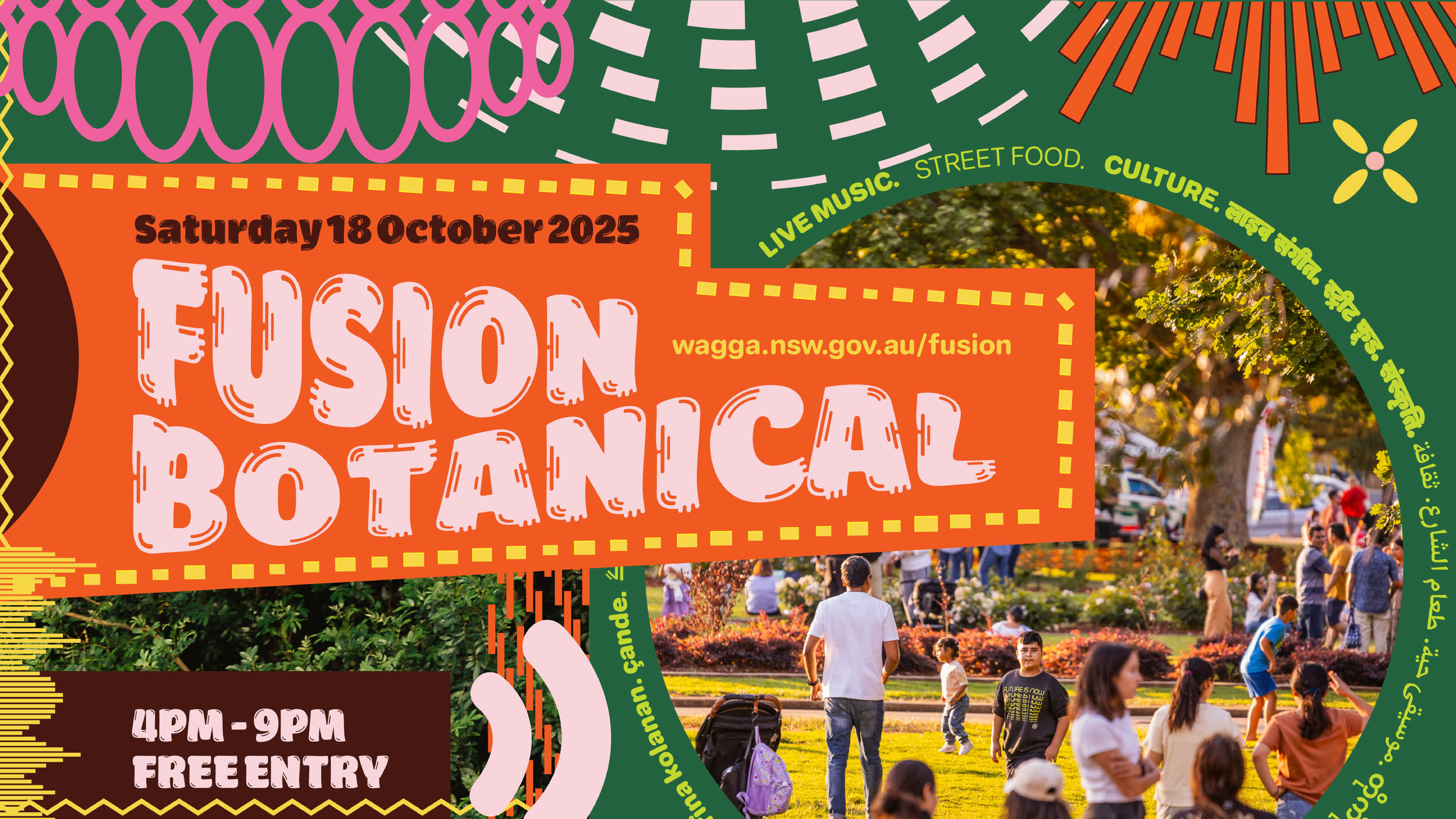
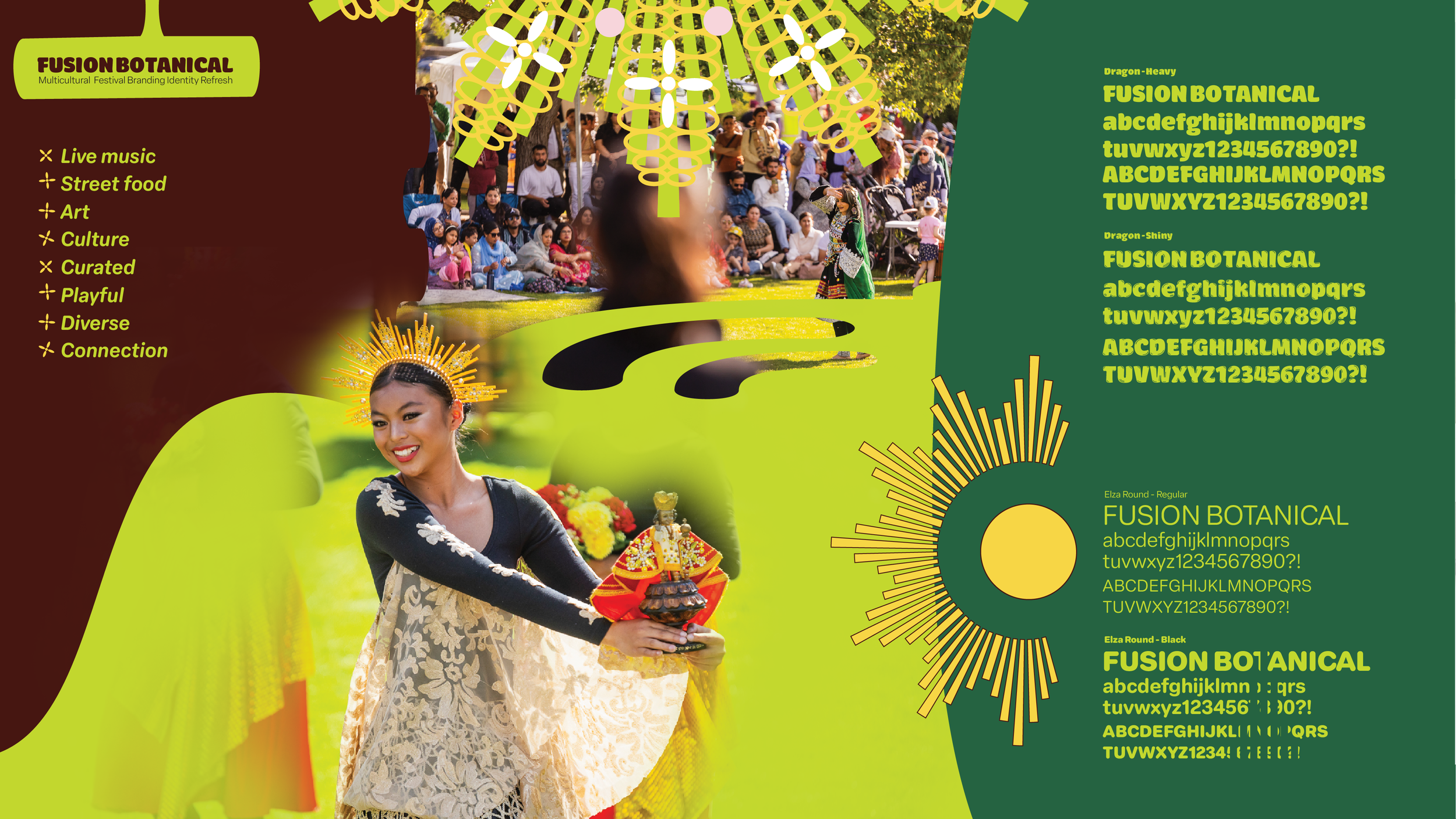
Image: An initial stylescape introducing the client to the feel of the visual identity refresh.
“Being the right fit as a designer for projects like FUSION BOTANICAL goes beyond creative capabilities. We bring a unique local lens that understands the nuances of community and place. Our deep involvement with people and genuine intention to honour Wagga Wagga’s cultural landscape allowed us to create something more than just visual identity. We developed a design system that truly resonates because it comes from deep understanding, not just observation. That connection to place and people makes all the difference in creating work that has lasting impact.”

