Drawing with Nina

“Fireworks” - Original drawing by Nina, pattern by Rach.
4 MIN READ
Once a week for thirty minutes, Nina and I share our screens, snapchat accounts and stories and draw together. We live 130kms from each other, are decades apart in age, but we have a shared love in a style of illustration that’s naive and colourful and pure.
In a typical session, Nina asks me what I ate for lunch that day, and what I’ve got planned for lunch the next day. We mostly talk about food (it’s both our favourite subjects) and cats. There’s no plan, we draw together. But the results each week are happily unpredictable.

“Flash the cat” - Original drawing by Nina, digitised by Rach ready for scene building, a pattern or animation.
My role as her creative mentor, combined with Nina’s intellectual disability, our shared love for drawing as a way to tell a story, and her parents dedication in setting her up with pre-vocational skills, provides space to explore with play and conversation at the heart of it all.
It’s as simple as that.
But how simple is it really, over video conferencing in Regional Australia where connection and audio lags? How simple is it really, when our ages, backgrounds and intellectual abilities are so juxtaposing? And how simple is it when I realise, I have so much knowledge to share, but need to be mindful that Nina and I observe and absorb the world in different ways.
Or do we?
Visual communication at it’s core, is how our consciousness interprets the world through sight. We pay attention to colour, form, depth and movement.
Using a web page as an example:
Colours differentiate categories of information;
Buttons signal us to click; and
Animations are used to pique our interest.
In every visual element, there’s a message attached which is communicated by aligning to accessibly guidelines (like these).
In essence, breaking down or simplifying information enables inclusive information for all.

How the letters M, O and Q can be represented differently, depending on whether they are placed together horizontally or vertically.
Back when I had the opportunity to work with IDEAS, I had the task of visually communicating the two methodologies supporting the word, ‘disability.’
Without going into too much detail (you can read more here), society conditions us to live by the medical model, or that people with disability are ‘impaired’ or, ‘the problem’ and there is a ‘cure’ or methods in which to ‘alleviate the effect.’
This is of course, opposed by the social model.
The social model works more with our environment and attitudes towards people with disability. Quite simply, the way we live, work and play has not been designed to be inclusive for everyone.

A visual representation of the social model of disability communicating, environmental, attitudinal, and organisational barriers to those living with disability.
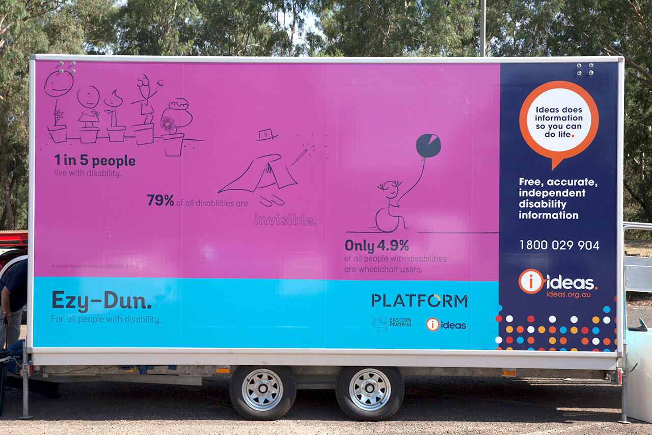
With one in five people in Australia living with disability and only 4.9% of those being wheelchair users, it’s not just about stairs vs ramps. Working with Nina helps me realise how things don’t need to be complicated to be powerful. And how we can be more inclusive in our attitudes and how we communicate with everyone.
Through my encouragement to Nina in directing me in the digitising of her work (even if it’s the type of green used), I’ve seen incredible improvement. The goal is that these small, simple steps will have a flow on effect to how she communicates with her peers.
It’s amazing to think art embodies this possibility!

Nina directs colour green she prefers in one of our sessions.
I believe when visual ideas are communicated simply, the information is more readily understood and memorable, especially when it’s on the side of a portable accessible bathroom, like Ezy-Dun here.